
Linkup Paint Supplies Form/Report Re-Designs 2018
In 2018 we decided to update the designs of the most used forms and reports for Linkup Paint Supplies in Hamilton, Wellington, and Auckland New Zealand. Linkup uses Accredo Saturn Accounting Software and we found the default forms didn't reflect their brand as well as we'd like them to, so the re-design process started and was completed within a couple of weeks after some testing and implementation testing. All of the forms utilize Accredos built in "Branches" information, allowing the exact same form design to be used across the multiple branches and even data files.
Contents:
01. Quote Design
02. Picking Order Design
03. Packing Slip Design
04. Invoice Design
05. Thermal Receipt Design
06. Purchase Order Design
07. Statement Design
(All information in the forms below is purely example sample data generated in the local "Play Company" and does not reflect any real invoices or customer information)
Below are the before and after shots of each report in order of usage.
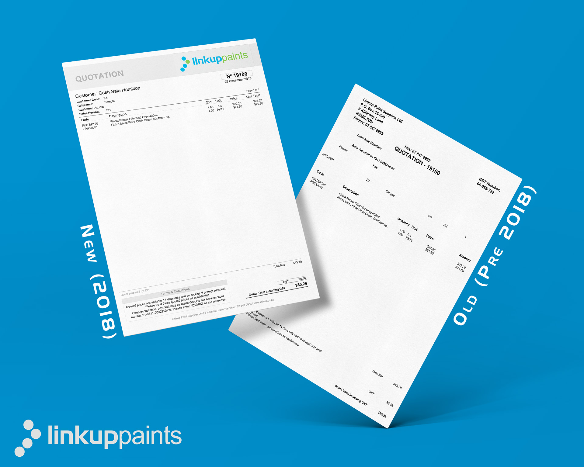
01. Quotation Design
Quotes are used for supplying quotations to customers on a constant basis. We felt the forms held too much information that wasn't needed for quotes, so we simplified the design as much as we could and made it as obvious as possible that it wasn't an invoice to avoid confusion there has been previously. We also added titles with information that previously didn't have it which often caused confusion.
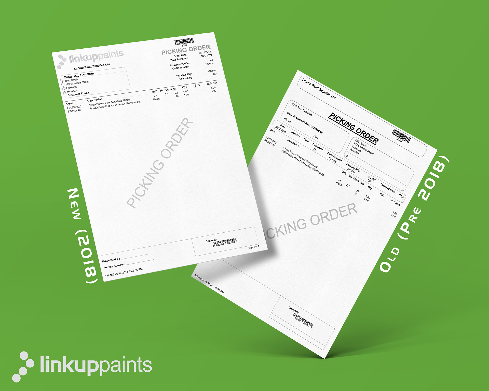
02. Picking Order Design
Picking orders are used internally for picking stock when a customer places an order. We needed this form to look different to invoices to make sure at a glance people knew straight away that they hadn't been processed and didn't go out with the customers stock instead of the invoice. We also added in lines for filling out information in the bottom left once it's processed as each staff member wrote this information in different places making it hard for the office staff to quickly find the information at a glance. This design is also all grey-scale as it's only used internally, and this helps the team to cut down on printing costs.
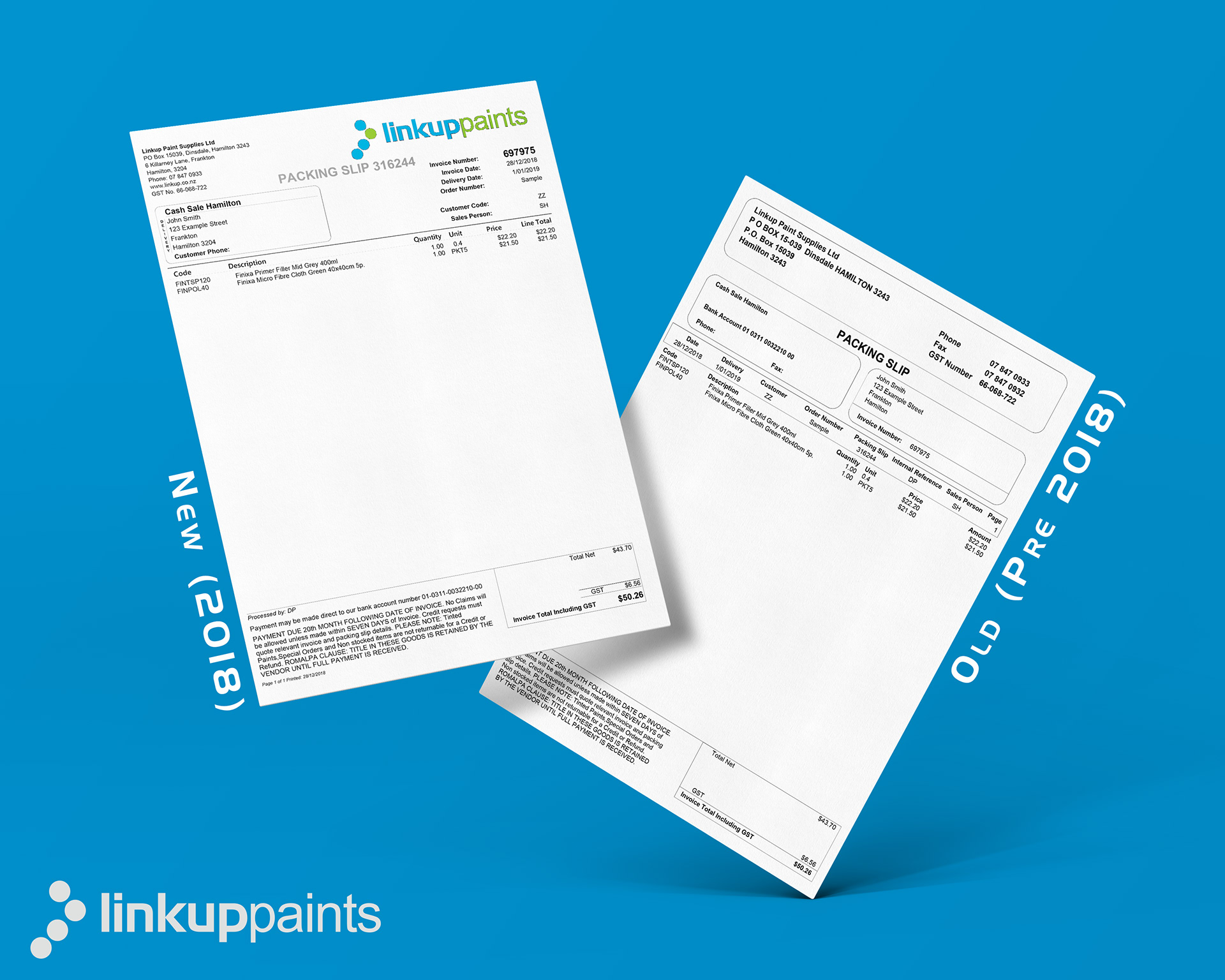
03. Packing Slip Design
Packing slips are used to send out the goods to the customer and are different to a Tax Invoice as they are only used by the inwards goods team at the customer for receipting the items at their end. Because of this we placed all the vital information in one place on the top right of the page design and then just updated the rest of the design to match the other new layouts.
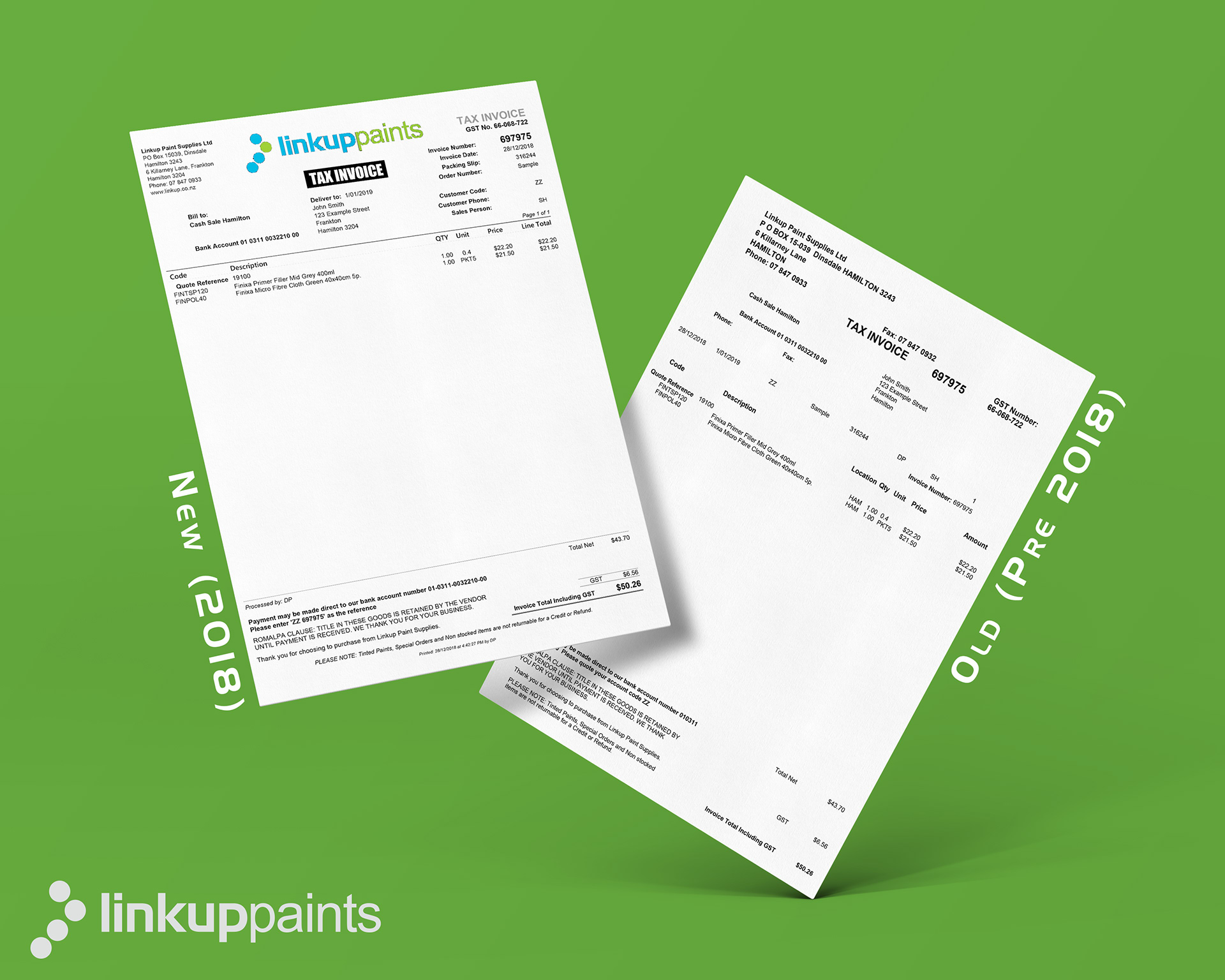
04. Invoice Design
Tax Invoices are the most important pieces of paper for the customers accountants, so we put as much information on there as possible without over-loading the design, while also reflecting commonly requested information from the customers. The design reflects the Packing Slip with the important information on the top right, but also shows "Head Office" where the items were delivered to and when (if set).
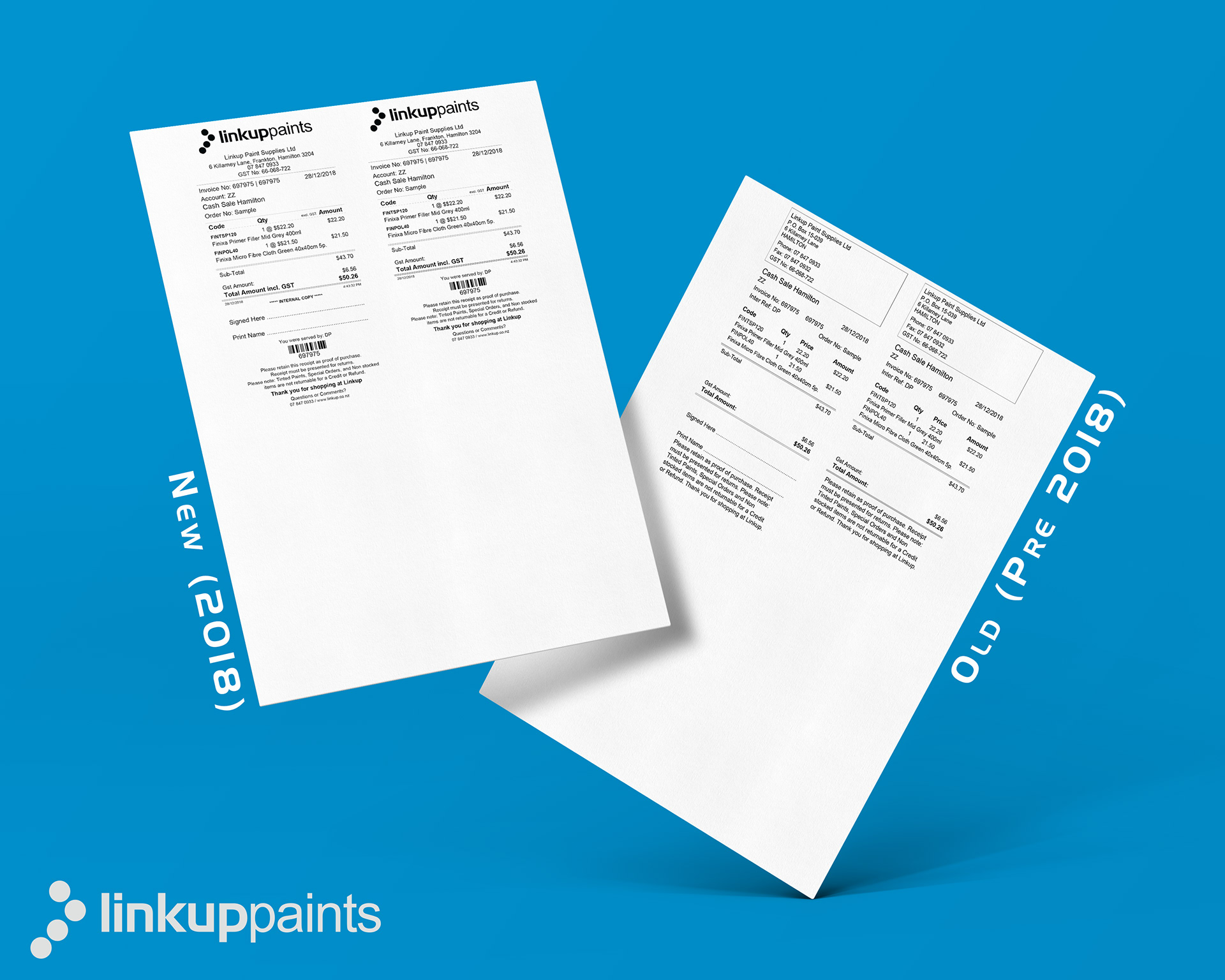
05. Thermal Receipt Design
Both the Hamilton and Auckland branches use receipt print-outs for customers picking up their orders to sign for the items on collection, just in case a customer queries an order. They are given a copy to take with them and the signed copy is kept on-site. This report didn't need too much of an update but we placed in some subtle differences to reflect the branding of the other forms, and also make some parts of it easier for both staff and customers to read where data used to flow into other fields since the format is so small.
(Each of the pages prints out as a standard thermal roll size and cuts off each page. Mockup is NOT to scale)
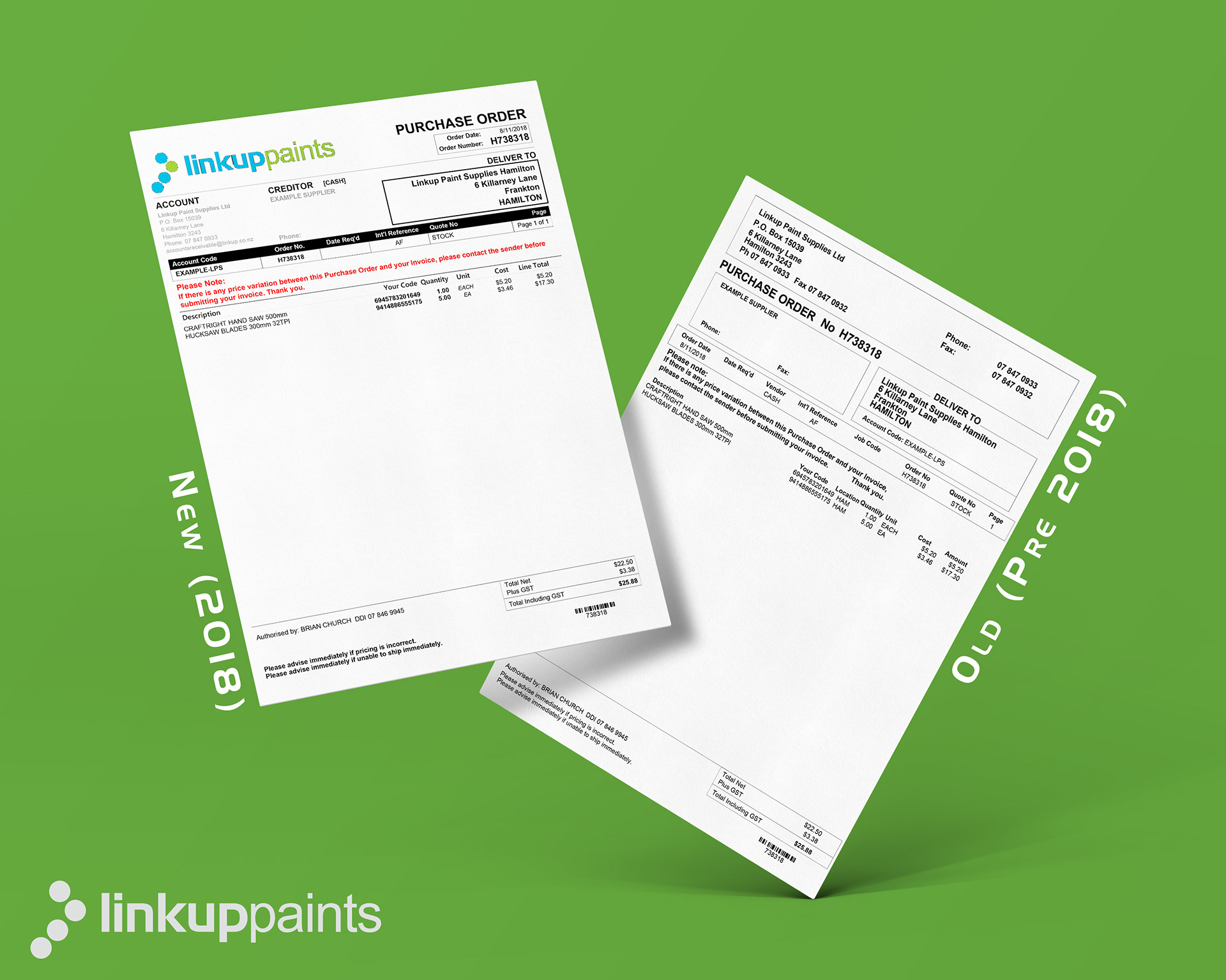
06. Purchase Order Design
Purchase Orders are used for ordering stock from suppliers (vendors). Again, this report was mainly updated to reflect the branding on other forms, but also to try and reduce confusion when order for multiple branches by making the branch specific information bold on the forms. We also tried to make more of a distinction between the "quantity" and "unit" fields as suppliers had a tendency to confuse these and supply the wrong quantities.
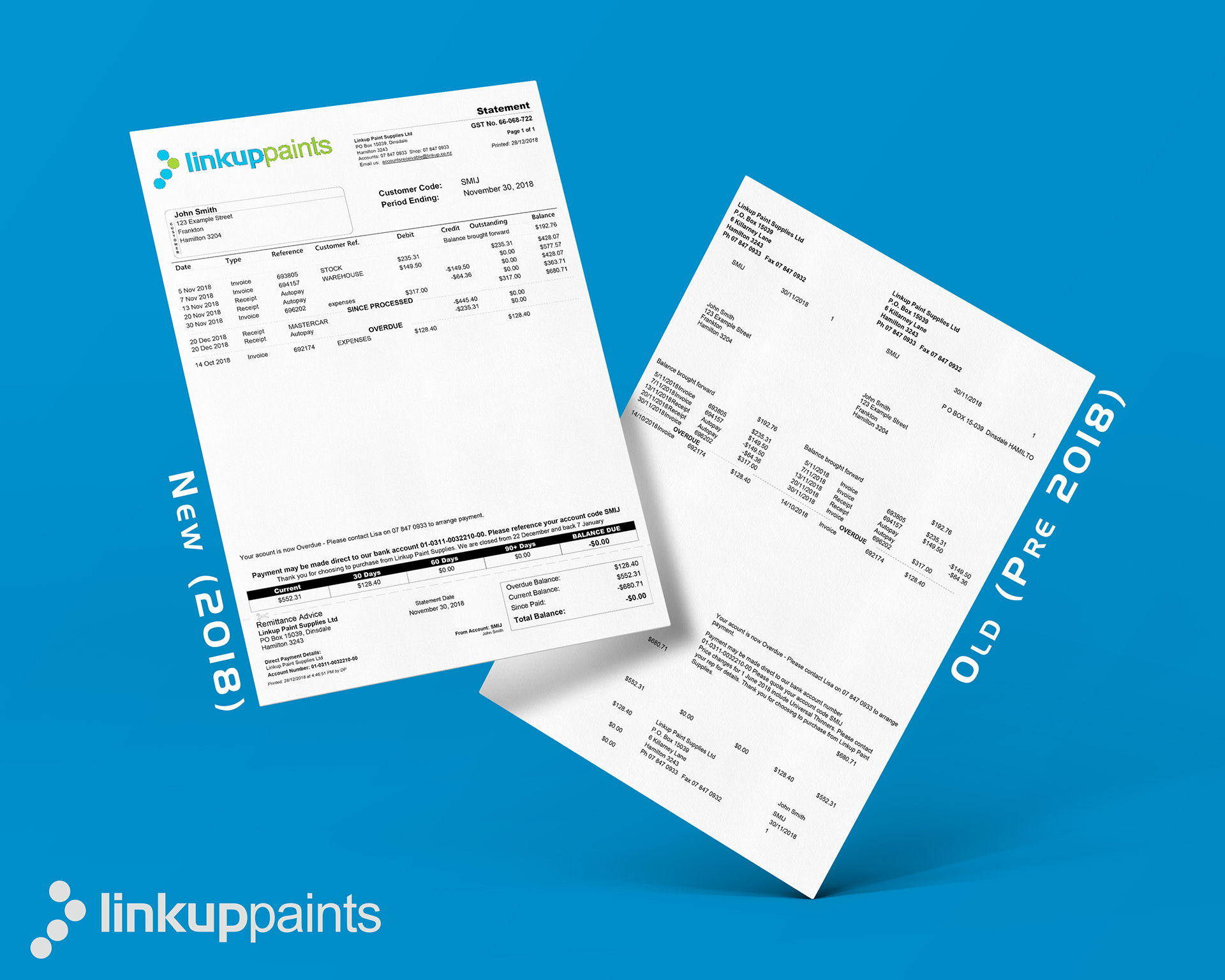
07. Statement Design
With a lot of feedback from the customers, and also pre-printed statement stationary running out of stock, we decided to bring the statements into an easier to read format while also reflecting the branding on other forms. We took the opportunity to also add in some new data to hopefully make it easier for any accountant to read and understand. The old report had a perforated line to the left so the customer could tear off and keep the right while sending the left back left with the remittance advice. However, in the 21st century this is now done mostly via email, so we updated the new design to reflect this and use that space for more useful information to help the customer get their accounts in line.

If you would like for me to re-design your reports as well, check me out at www.dpdesignz.co.nz and contact me today. I'd love to work with you!
Thanks for reading!